Collections
A collection in a NoSQL database is analogous to a table in a relational database. However, unlike tables that have a fixed schema with predefined columns, collections can store documents with varying structures and fields, offering greater flexibility and scalability. This schema-less or dynamically typed approach makes NoSQL databases well-suited for handling large-scale data sets, structured and unstructured data.
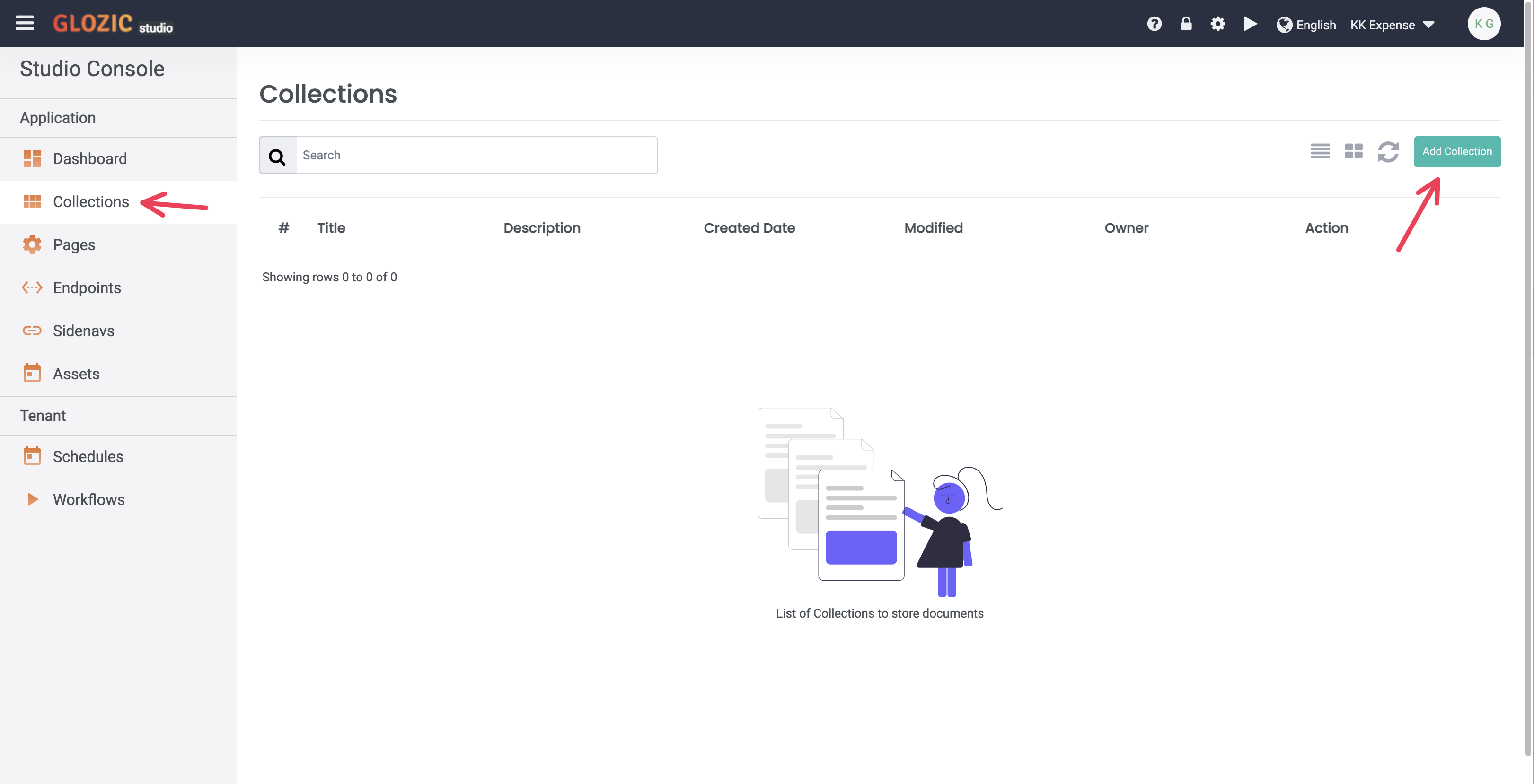
Select Collections menu from the SideBar, Collections list will show similar to below screen capture (i.e. there is no collections listed when you first created the application).
Create your first Collection
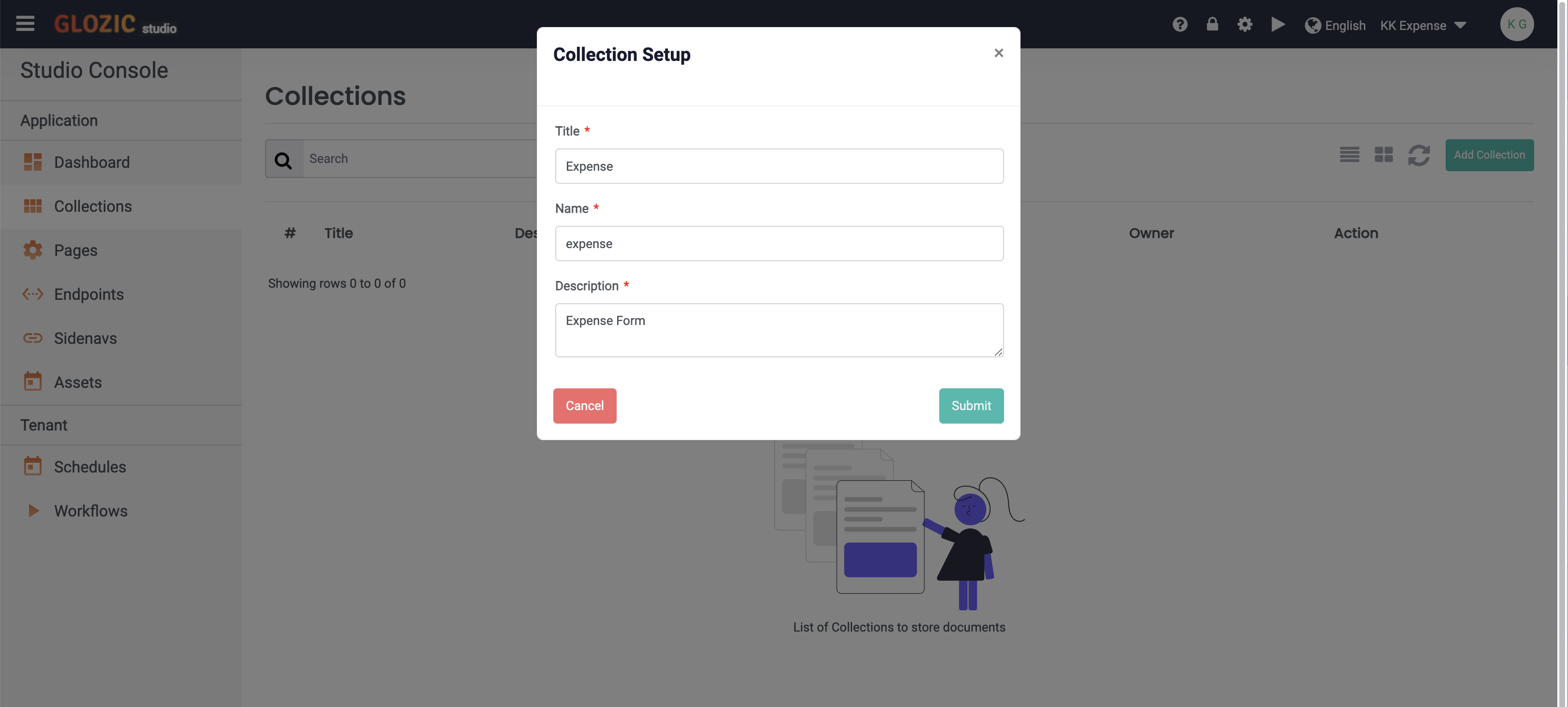
Click on the "Add Collection" button to create your first collection. Create an Expense collection with the following properties:
Title: Expense
Name: expense
Description: Expense Form
and Submit to confirm creation of Expense collection.
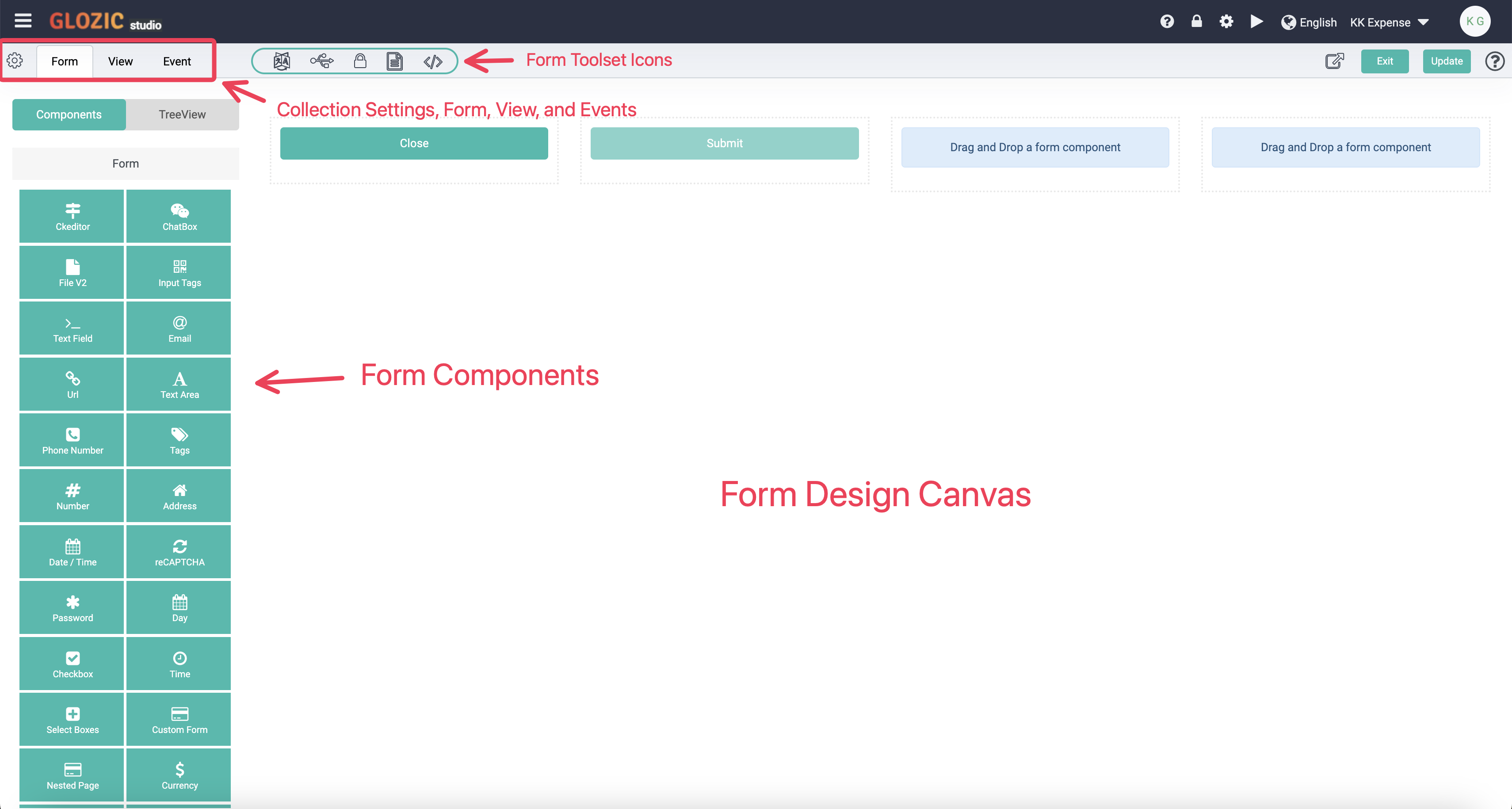
The following screen capture shows the Collection Designer and various design elements as highlighted in the screen shot.
Collection Form
Select Layout group header from the Form Components panel, drag-and-drop a Div component to the Form Canvas component placeholder as shown in the diagram below:
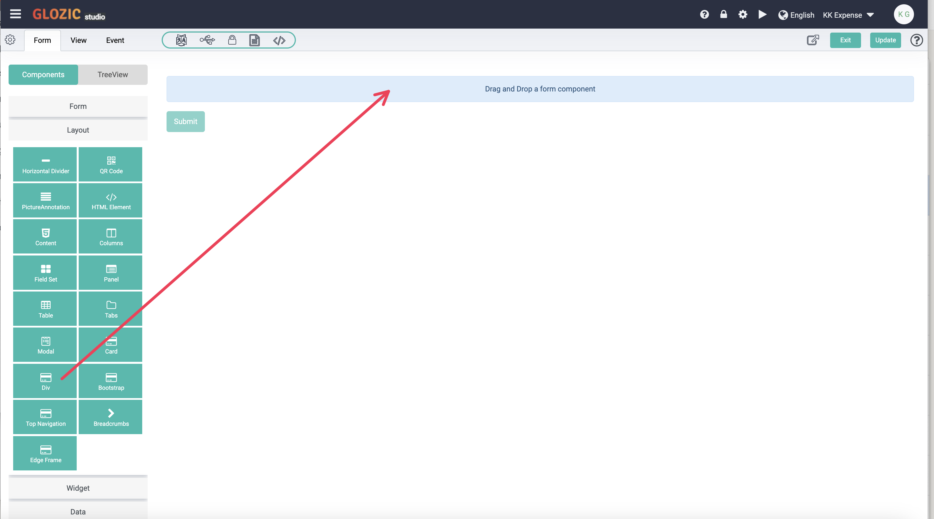
Once you have dropped the Div component onto the Form Canvas, the component configuration dialog box will be opened for further configuration as shown in the below screen capture.
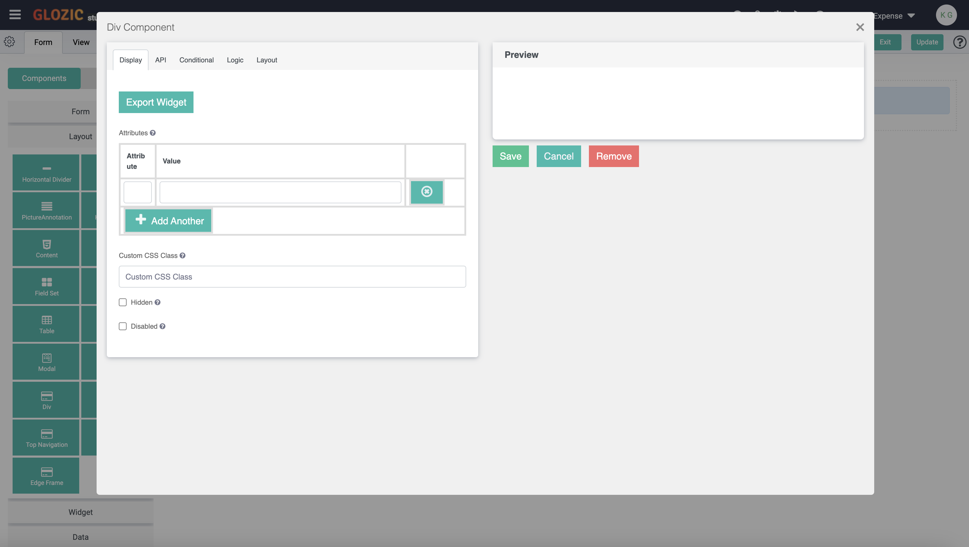
Leave it as it is without any configuration, click the Save button to save the component configuration. Notice that we have added a Div onto the canvas, move the cursor to the component, and it should be highlighted as shown in the below screen capture
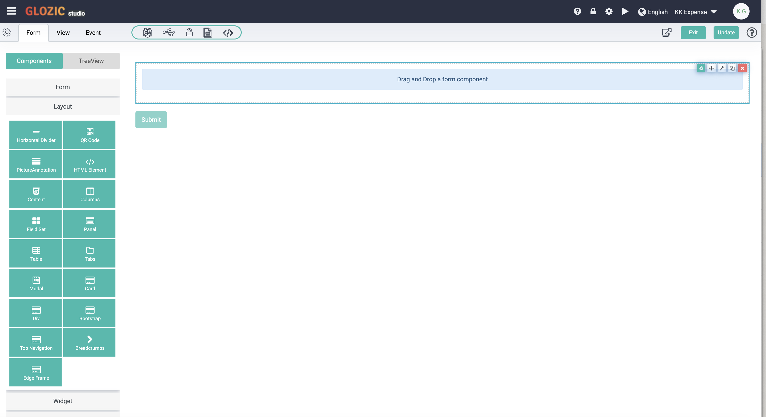
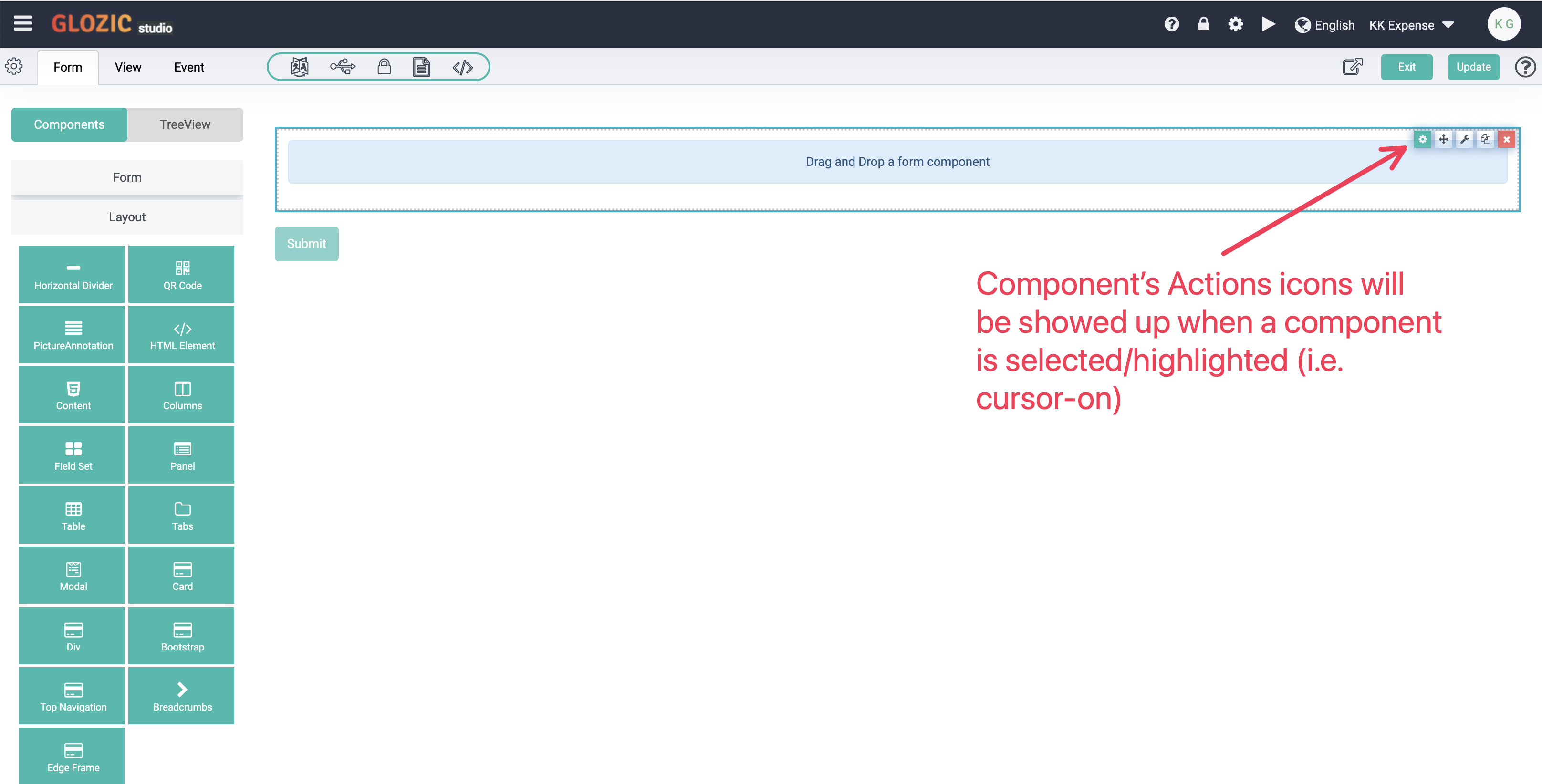
Move mouse cursor over or on-top of the Div component again, noticed the component's actions icon set will also show up, click on the Cog icon to configure the Div component again.
Enter w-75 mx-auto align-items-center in the Custom CSS Class field as shown below, and click Save button to save configuration changes.
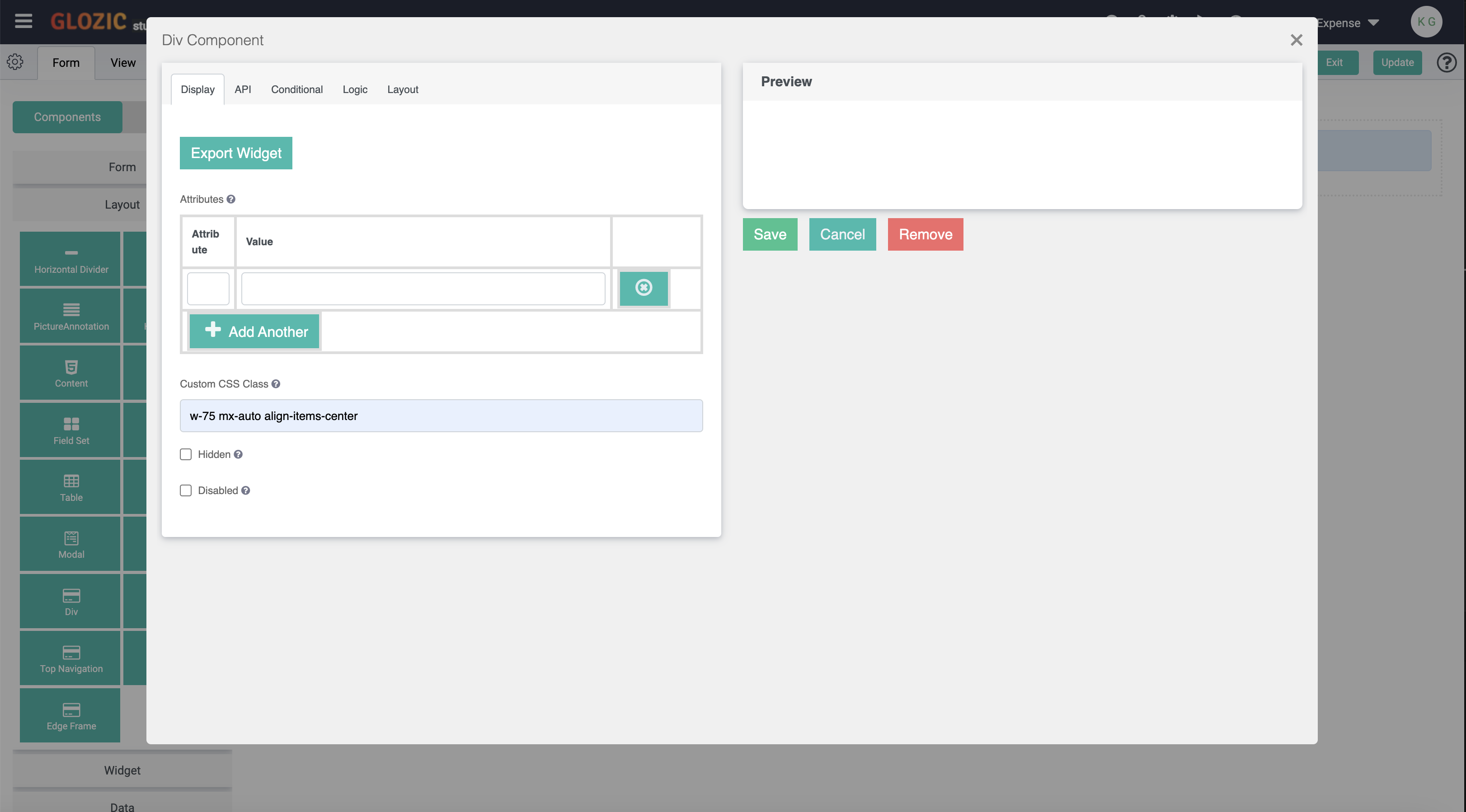
Bootstrap v4 is default front-end framework used in Glozic platform, CSS classes will be recognised by default. For more details on Bootstrap is available at Bootstrap link.
Move mouse on top of the Div component again, and verify now the component is size to width of 75% of the canvas width. Other CSS Classes could be applied the same way for all other form components.
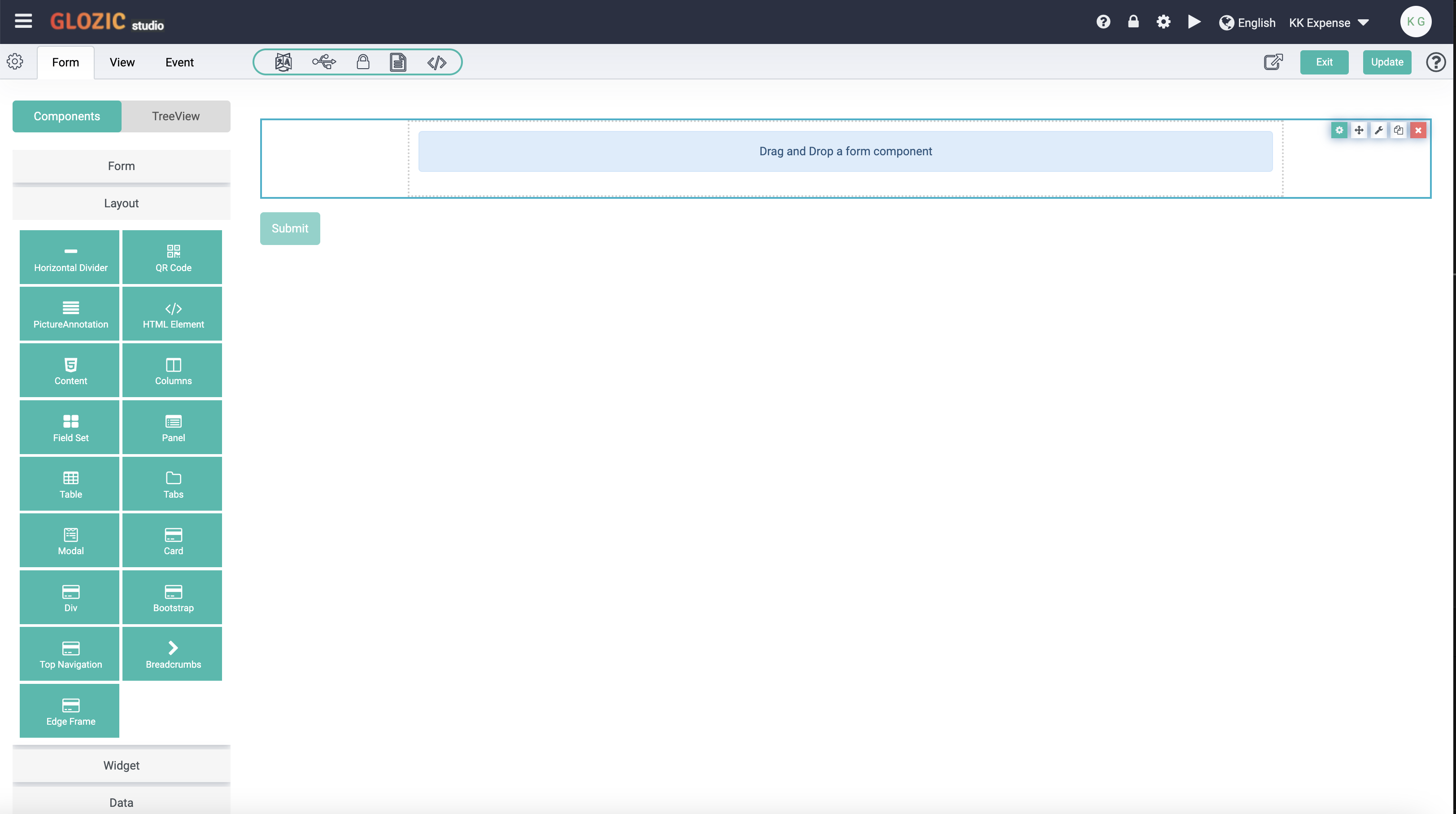
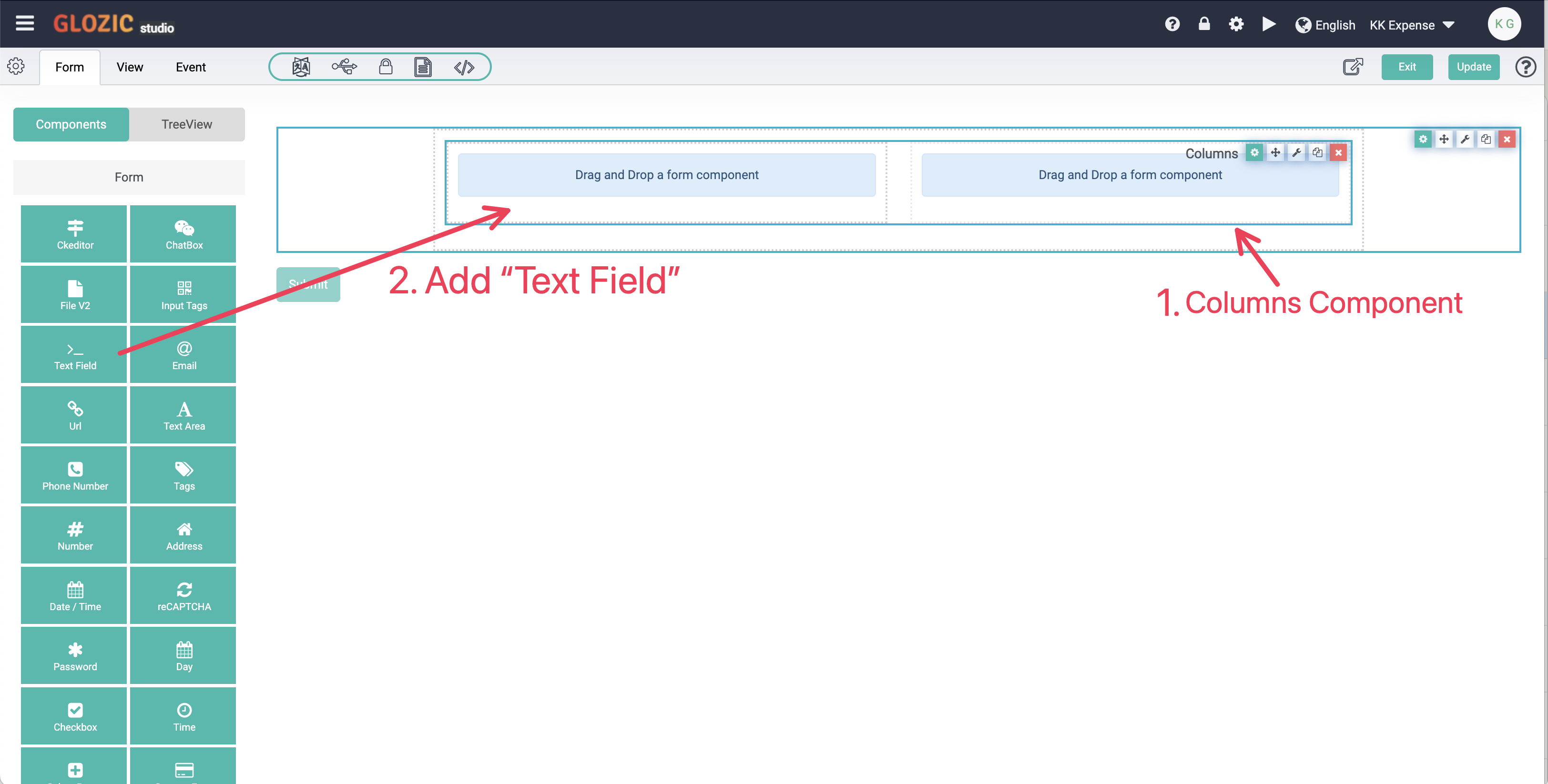
Drag-adn-drop a "Columns" component from the Layout group, followed by a "Text Field" component from the Form group to the first column of the Columns component.
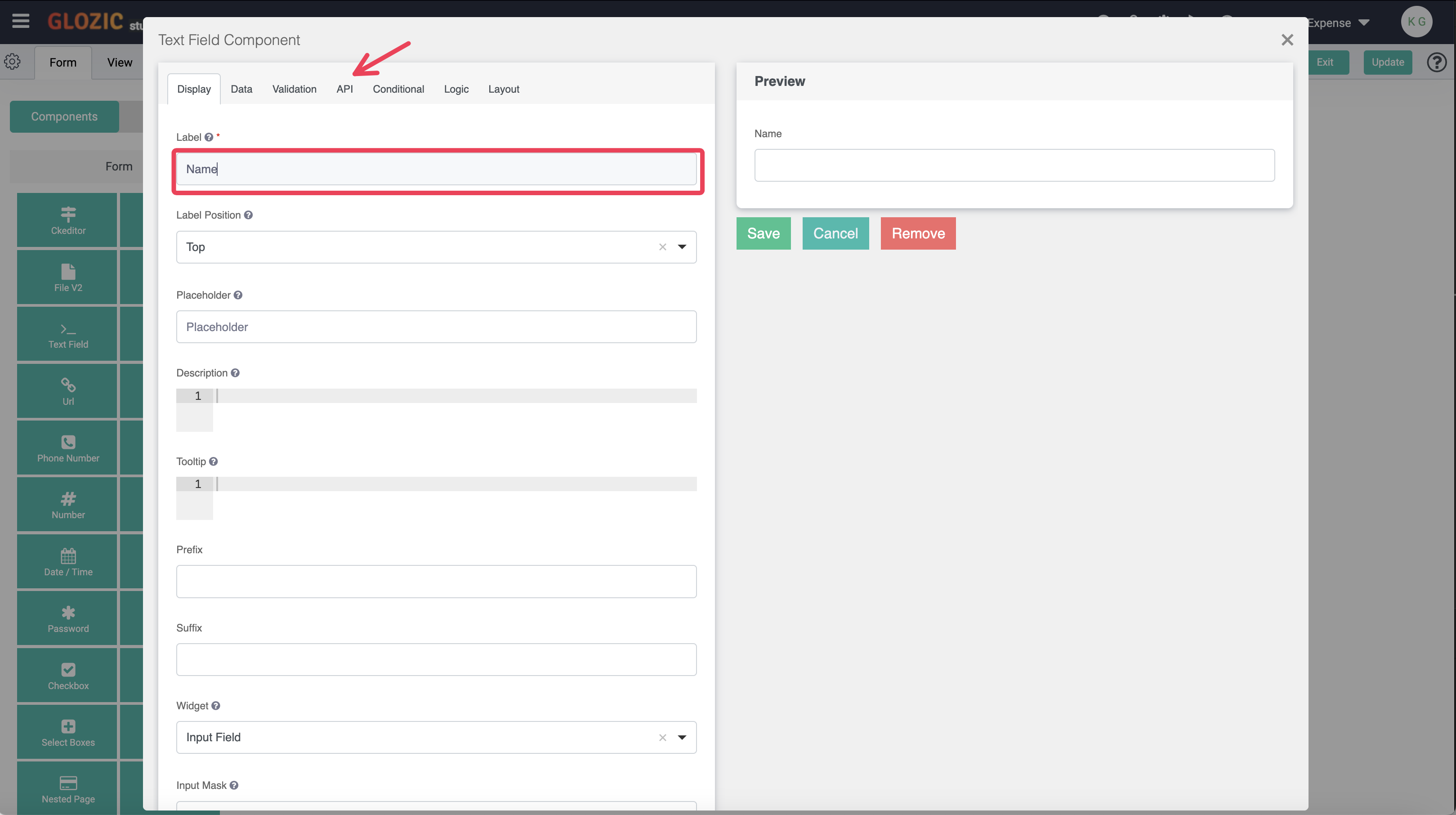
Once you have dropped the Text Field component onto the Form Canvas, the component configuration dialog box will be opened as showned in screen capture below, enter "Name" in the Label field, click the API tab to verify the Property Name field's value should auto set to name by default.
Property Name is a unique key name of components, used as schema's field name. See below an example of the data structure:
{
  "name":"<value>"
}
Click Data tab to go to the Data settings of the Name component, enter value = form.user.firstname + " " + form.user.lastname;
You will need to scroll down to find the JavaScript code editor under the Custom Default Value section
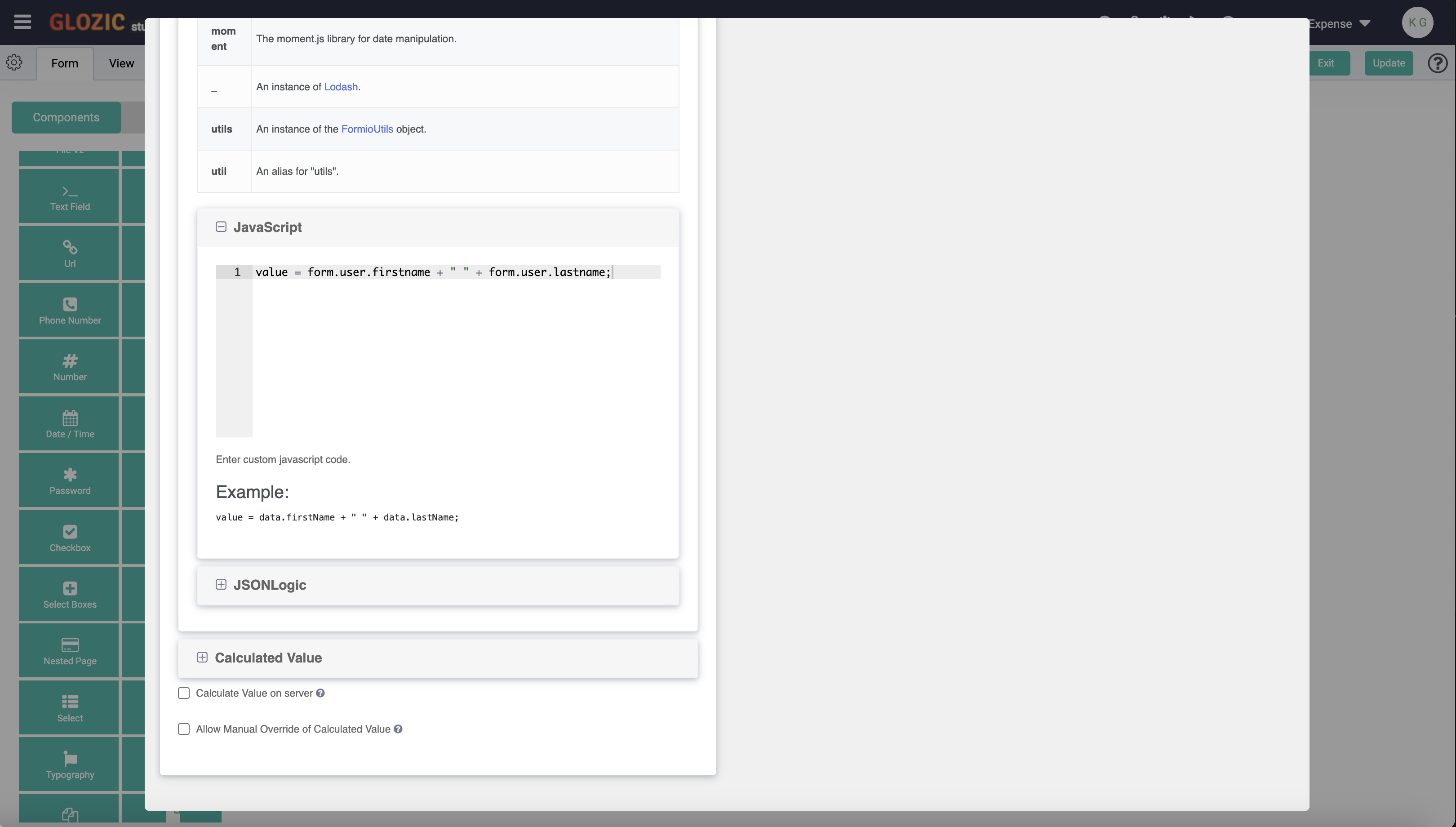 Scroll the Property dialog box up until you see the "Save" button, click the Save button to save the Name component's settings.
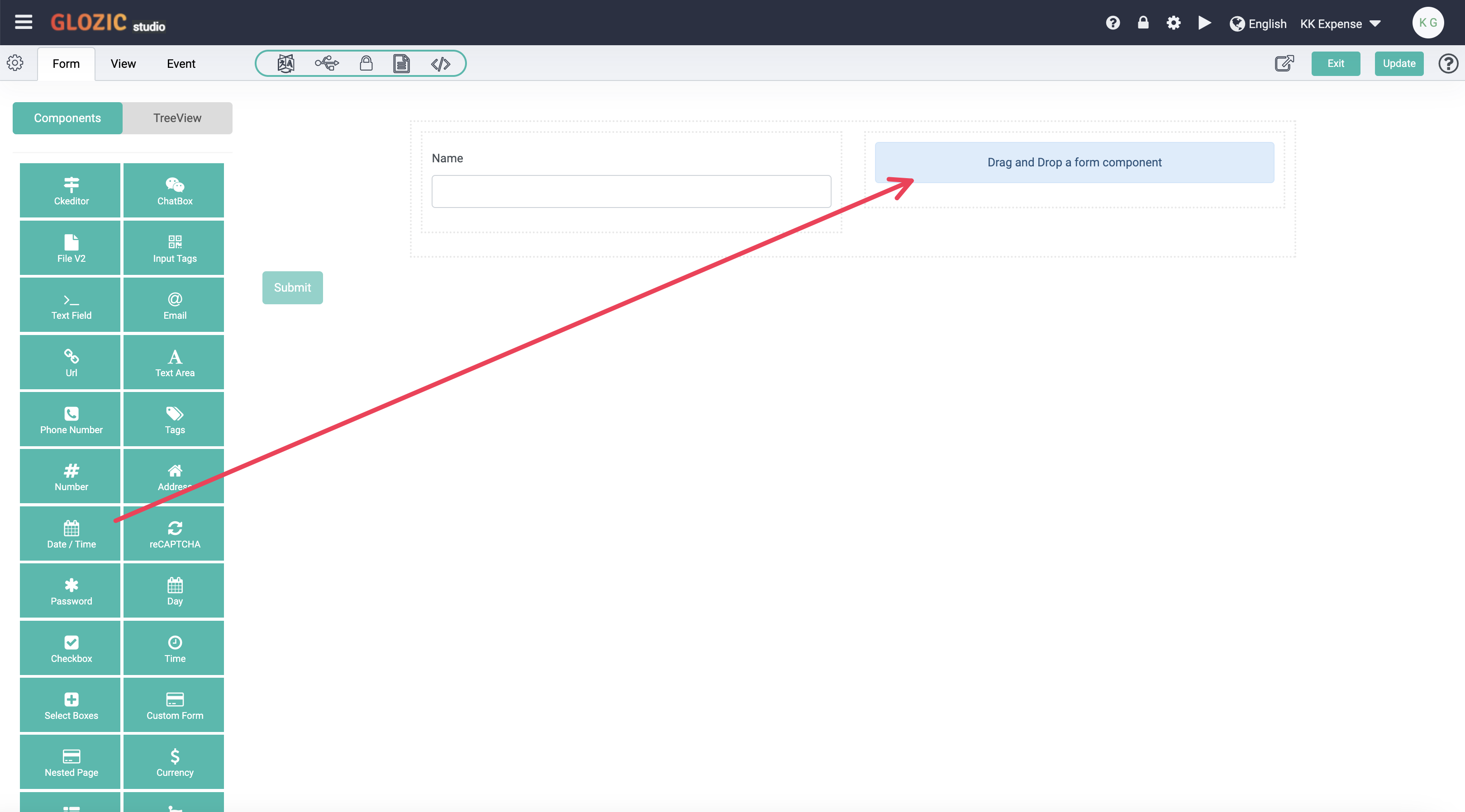
Drag-and-drop a "Date/Time" component from the Form component group onto the Placeholder inside the second column of the Columns component as shown in the screen capture below:
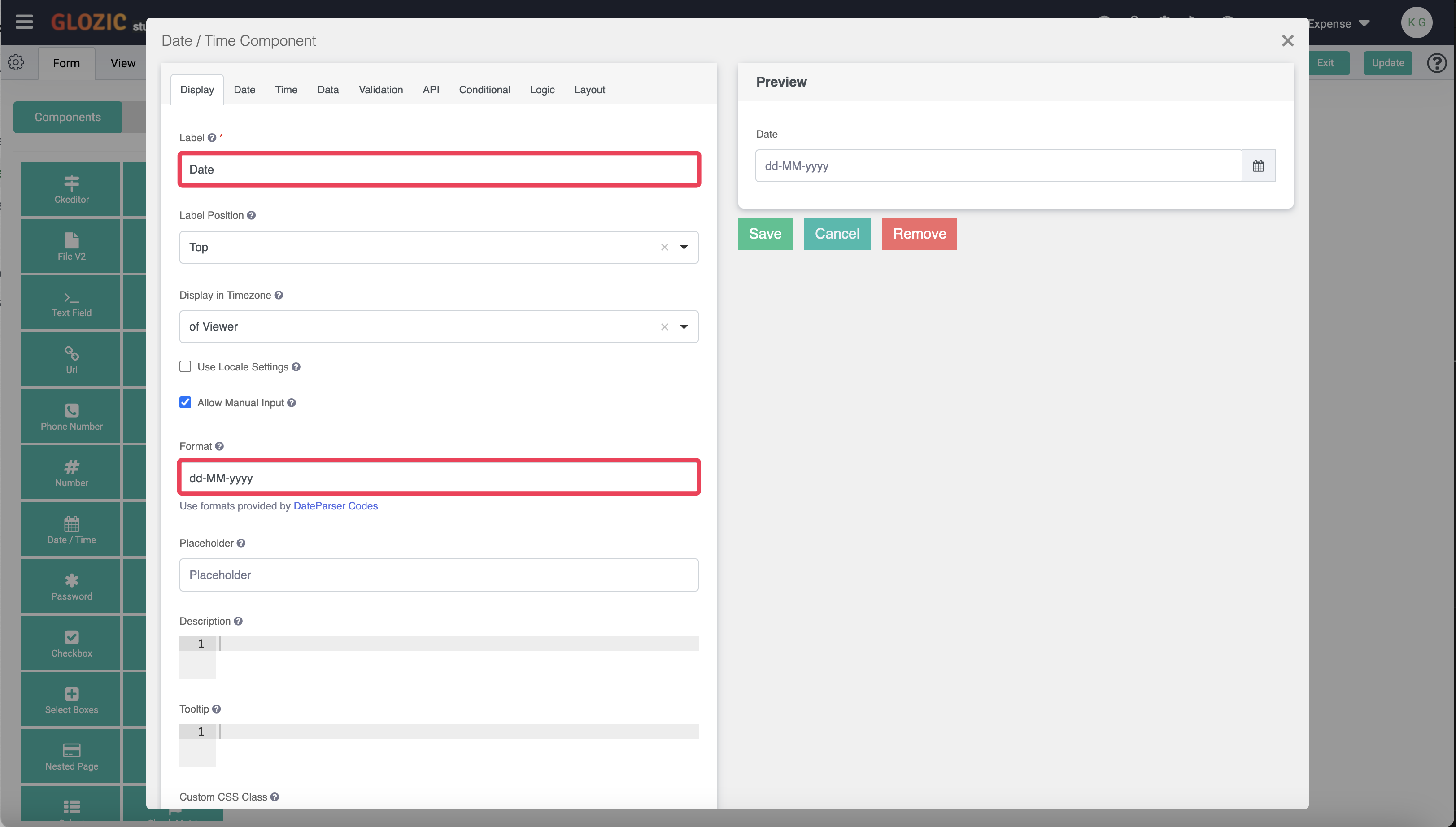
Enter or change the value of the Label field to date, change the value of the Format field to dd-MM-yyyy. Click on the Data tab and scroll to and click the Custom Default Value section to expand the Customer Default Value section, look for the JavaScript code editor and enter value = moment(); to set default value of the component to current data/time value.
Take note of the description under the Format field with link to the DateParser Codes for more information on how to format a Date / Time value.
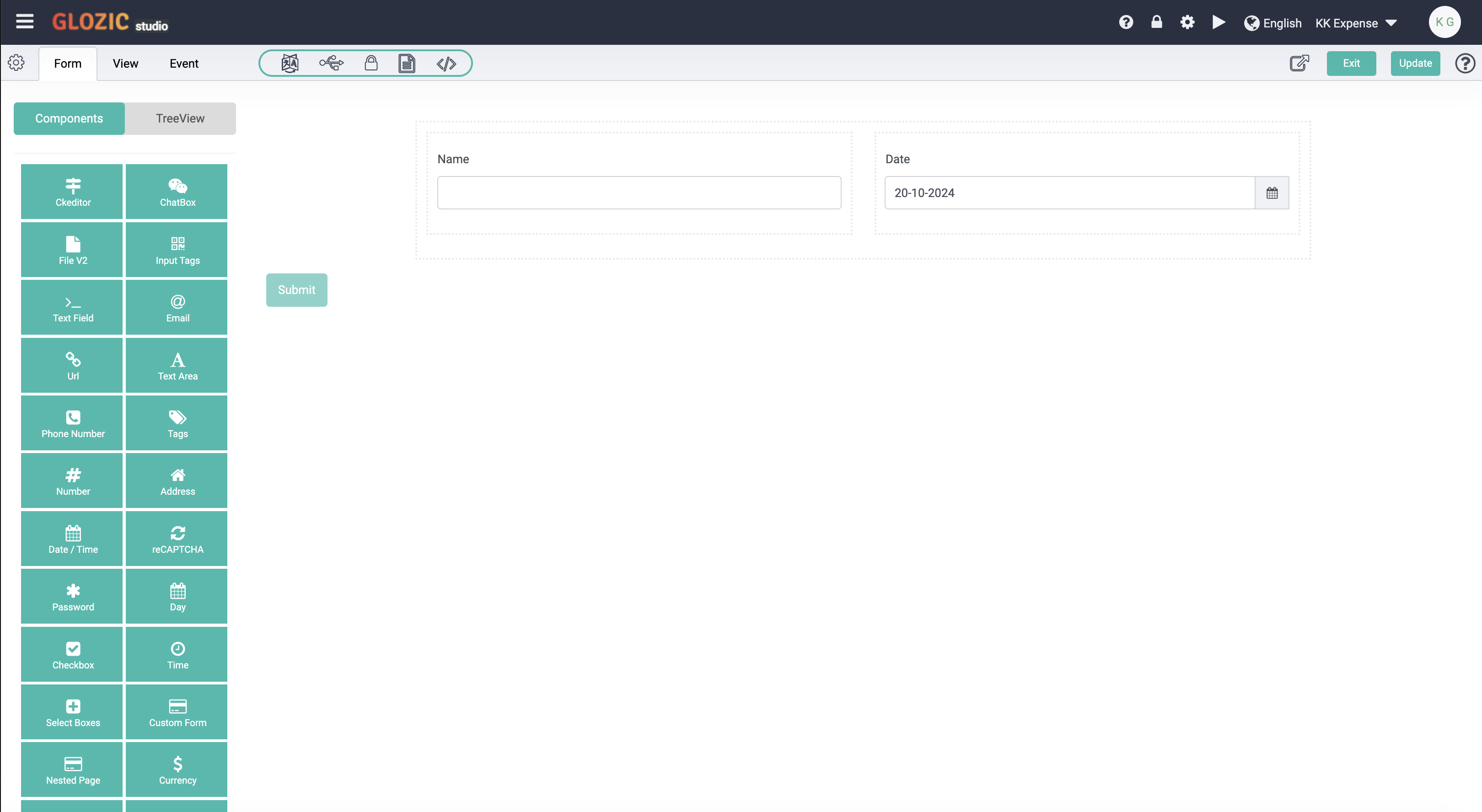
Save the configuration of the Date component, the component configuration dialog box will be closed and you should be getting the form design as shown in the screen capture below:
Drap-and-drop the "Submit" button component inside the Div component (i.e. below the Columns component) to get Form components layout and design as shown in the below screen capture.
The screen capture also highlights the Spanner component setting icons (i.e. thrid icon from the left)
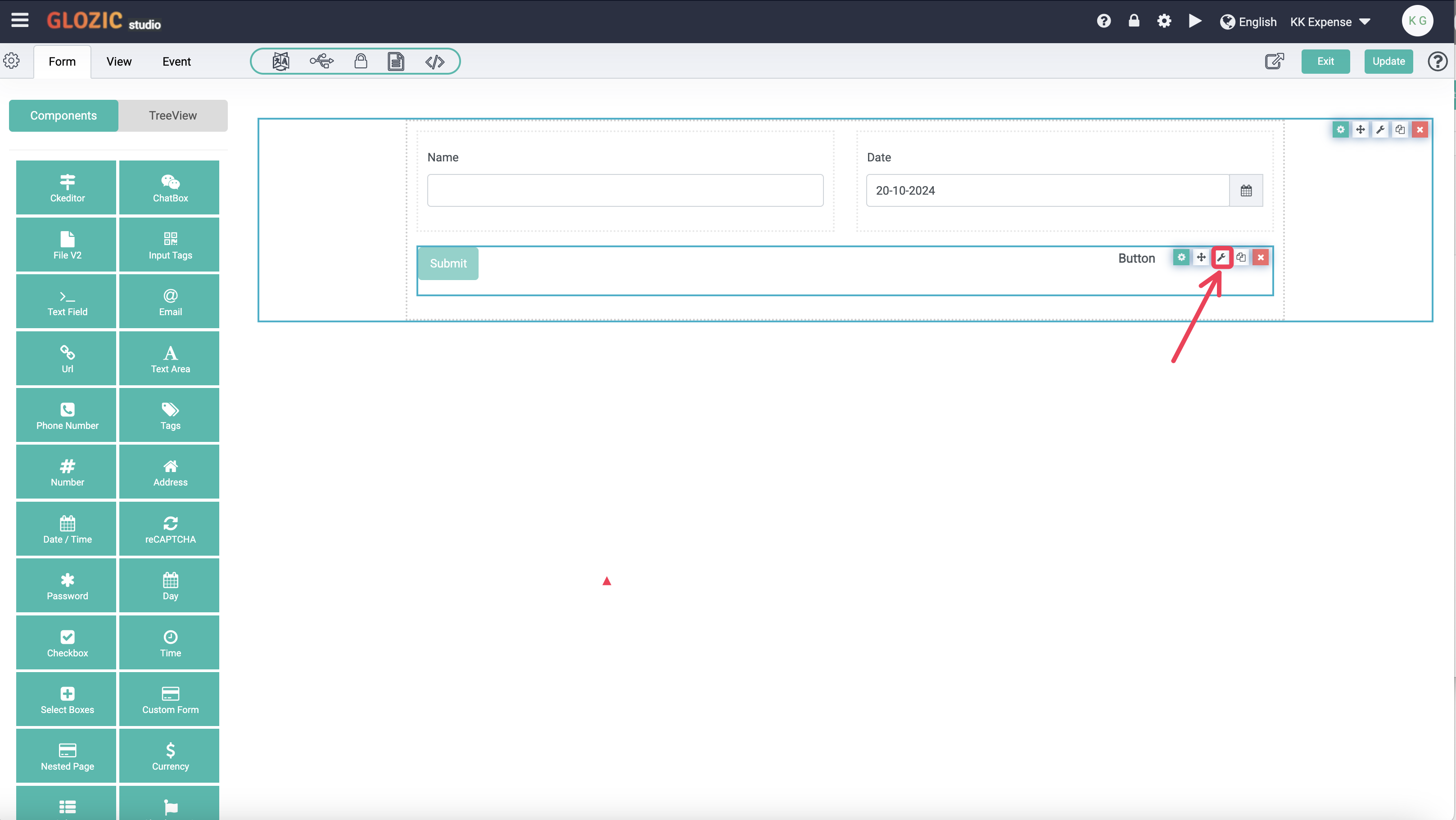
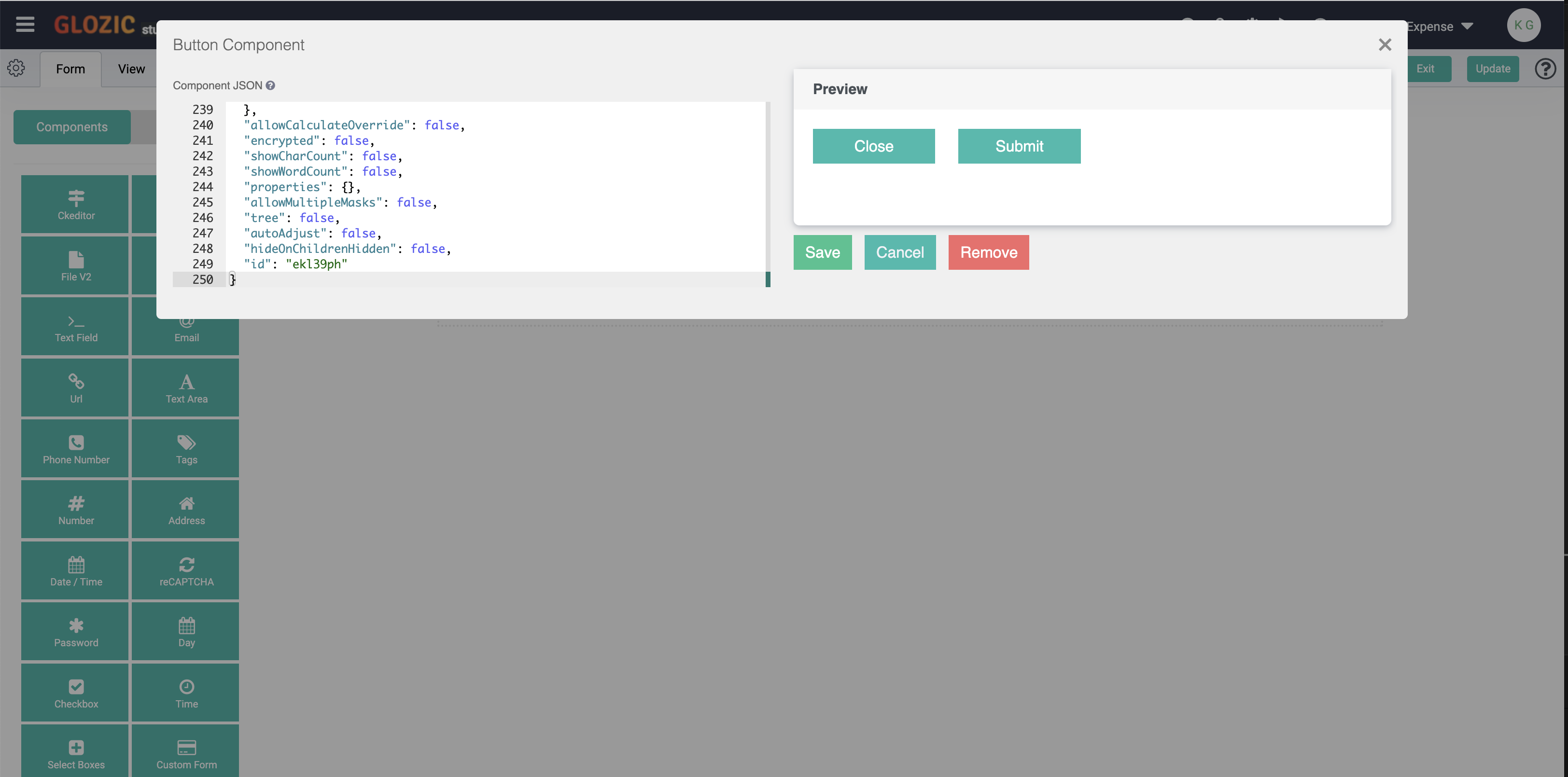
Click the Spanner icon from the Component's icon set (i.e. highlighted in the previous screen capture). Replace the entire value of the Component JSON with the following JSON content
{
  "label": "Columns",
  "columns": [
    {
      "components": [
        {
          "label": "Close",
          "showValidations": false,
          "block": true,
          "tableView": false,
          "key": "close",
          "type": "button",
          "action": "custom",
          "input": true,
          "hideOnChildrenHidden": false,
          "custom": "location.href = 'javascript:history.back()'",
          "placeholder": "",
          "prefix": "",
          "customClass": "",
          "suffix": "",
          "multiple": false,
          "defaultValue": null,
          "protected": false,
          "unique": false,
          "persistent": false,
          "hidden": false,
          "clearOnHide": true,
          "refreshOn": "",
          "redrawOn": "",
          "modalEdit": false,
          "labelPosition": "top",
          "description": "",
          "errorLabel": "",
          "tooltip": "",
          "hideLabel": false,
          "tabindex": "",
          "disabled": false,
          "autofocus": false,
          "dbIndex": false,
          "customDefaultValue": "",
          "calculateValue": "",
          "widget": {
            "type": "input"
          },
          "attributes": {},
          "validateOn": "change",
          "validate": {
            "required": false,
            "custom": "",
            "customPrivate": false,
            "strictDateValidation": false,
            "multiple": false,
            "unique": false
          },
          "conditional": {
            "show": null,
            "when": null,
            "eq": ""
          },
          "overlay": {
            "style": "",
            "left": "",
            "top": "",
            "width": "",
            "height": ""
          },
          "allowCalculateOverride": false,
          "encrypted": false,
          "showCharCount": false,
          "showWordCount": false,
          "properties": {},
          "allowMultipleMasks": false,
          "size": "md",
          "leftIcon": "",
          "rightIcon": "",
          "disableOnInvalid": false,
          "theme": "primary",
          "dataGridLabel": true,
          "id": "e3efp"
        }
      ],
      "width": 3,
      "offset": 0,
      "push": 0,
      "pull": 0,
      "size": "md"
    },
    {
      "components": [
        {
          "label": "Submit",
          "showValidations": false,
          "block": true,
          "tableView": false,
          "key": "submit",
          "type": "button",
          "input": true,
          "hideOnChildrenHidden": false,
          "placeholder": "",
          "prefix": "",
          "customClass": "",
          "suffix": "",
          "multiple": false,
          "defaultValue": null,
          "protected": false,
          "unique": false,
          "persistent": false,
          "hidden": false,
          "clearOnHide": true,
          "refreshOn": "",
          "redrawOn": "",
          "modalEdit": false,
          "labelPosition": "top",
          "description": "",
          "errorLabel": "",
          "tooltip": "",
          "hideLabel": false,
          "tabindex": "",
          "disabled": false,
          "autofocus": false,
          "dbIndex": false,
          "customDefaultValue": "",
          "calculateValue": "",
          "widget": {
            "type": "input"
          },
          "attributes": {},
          "validateOn": "change",
          "validate": {
            "required": false,
            "custom": "",
            "customPrivate": false,
            "strictDateValidation": false,
            "multiple": false,
            "unique": false
          },
          "conditional": {
            "show": null,
            "when": null,
            "eq": ""
          },
          "overlay": {
            "style": "",
            "left": "",
            "top": "",
            "width": "",
            "height": ""
          },
          "allowCalculateOverride": false,
          "encrypted": false,
          "showCharCount": false,
          "showWordCount": false,
          "properties": {},
          "allowMultipleMasks": false,
          "size": "md",
          "leftIcon": "",
          "rightIcon": "",
          "action": "submit",
          "disableOnInvalid": false,
          "theme": "primary",
          "dataGridLabel": true,
          "id": "ezhgxrq"
        }
      ],
      "width": 3,
      "offset": 0,
      "push": 0,
      "pull": 0,
      "size": "md"
    },
    {
      "components": [],
      "size": "md",
      "offset": 0,
      "push": 0,
      "pull": 0,
      "width": 3
    },
    {
      "components": [],
      "size": "md",
      "width": 3,
      "offset": 0,
      "push": 0,
      "pull": 0
    }
  ],
  "tableView": false,
  "key": "columns",
  "type": "columns",
  "input": false,
  "placeholder": "",
  "prefix": "",
  "customClass": "",
  "suffix": "",
  "multiple": false,
  "defaultValue": null,
  "protected": false,
  "unique": false,
  "persistent": false,
  "hidden": false,
  "clearOnHide": false,
  "refreshOn": "",
  "redrawOn": "",
  "modalEdit": false,
  "labelPosition": "top",
  "description": "",
  "errorLabel": "",
  "tooltip": "",
  "hideLabel": false,
  "tabindex": "",
  "disabled": false,
  "autofocus": false,
  "dbIndex": false,
  "customDefaultValue": "",
  "calculateValue": "",
  "widget": null,
  "attributes": {},
  "validateOn": "change",
  "validate": {
    "required": false,
    "custom": "",
    "customPrivate": false,
    "strictDateValidation": false,
    "multiple": false,
    "unique": false
  },
  "conditional": {
    "show": null,
    "when": null,
    "eq": ""
  },
  "overlay": {
    "style": "",
    "left": "",
    "top": "",
    "width": "",
    "height": ""
  },
  "allowCalculateOverride": false,
  "encrypted": false,
  "showCharCount": false,
  "showWordCount": false,
  "properties": {},
  "allowMultipleMasks": false,
  "tree": false,
  "autoAdjust": false,
  "hideOnChildrenHidden": false,
  "id": "ekl39ph"
}
Save the Component JSON dialog box, which replaced the "Submit" button component with a new Component set (i.e. 4 columns with Submit and Close buttons) as shown in the below screen capture:
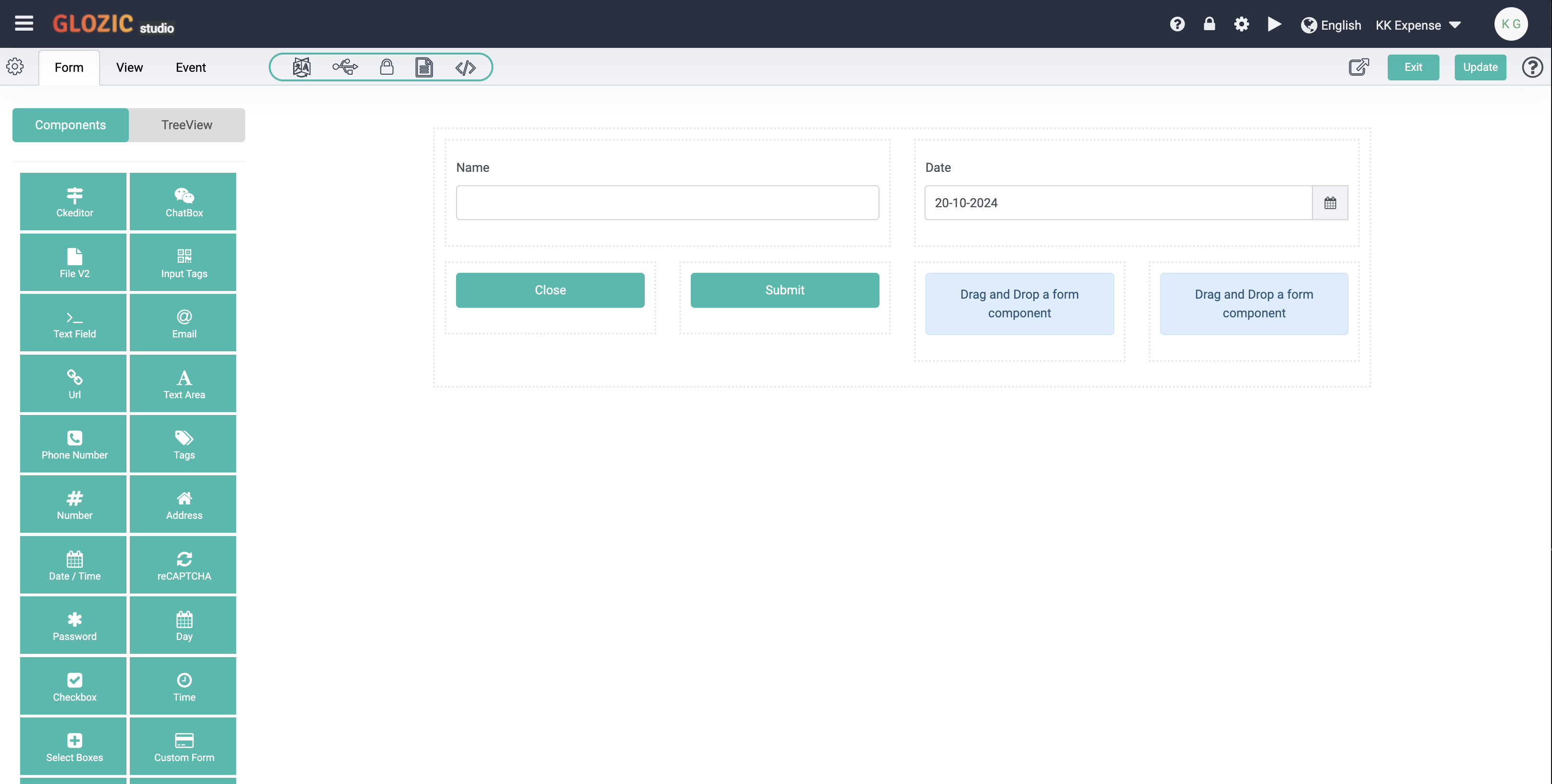
Click the Update button to save whatever we have done so far, and click Exit button to close or exit the Collection design. We have created a simple Expense collection, and it should be listed under the Collections list as shown in the below screen capture.
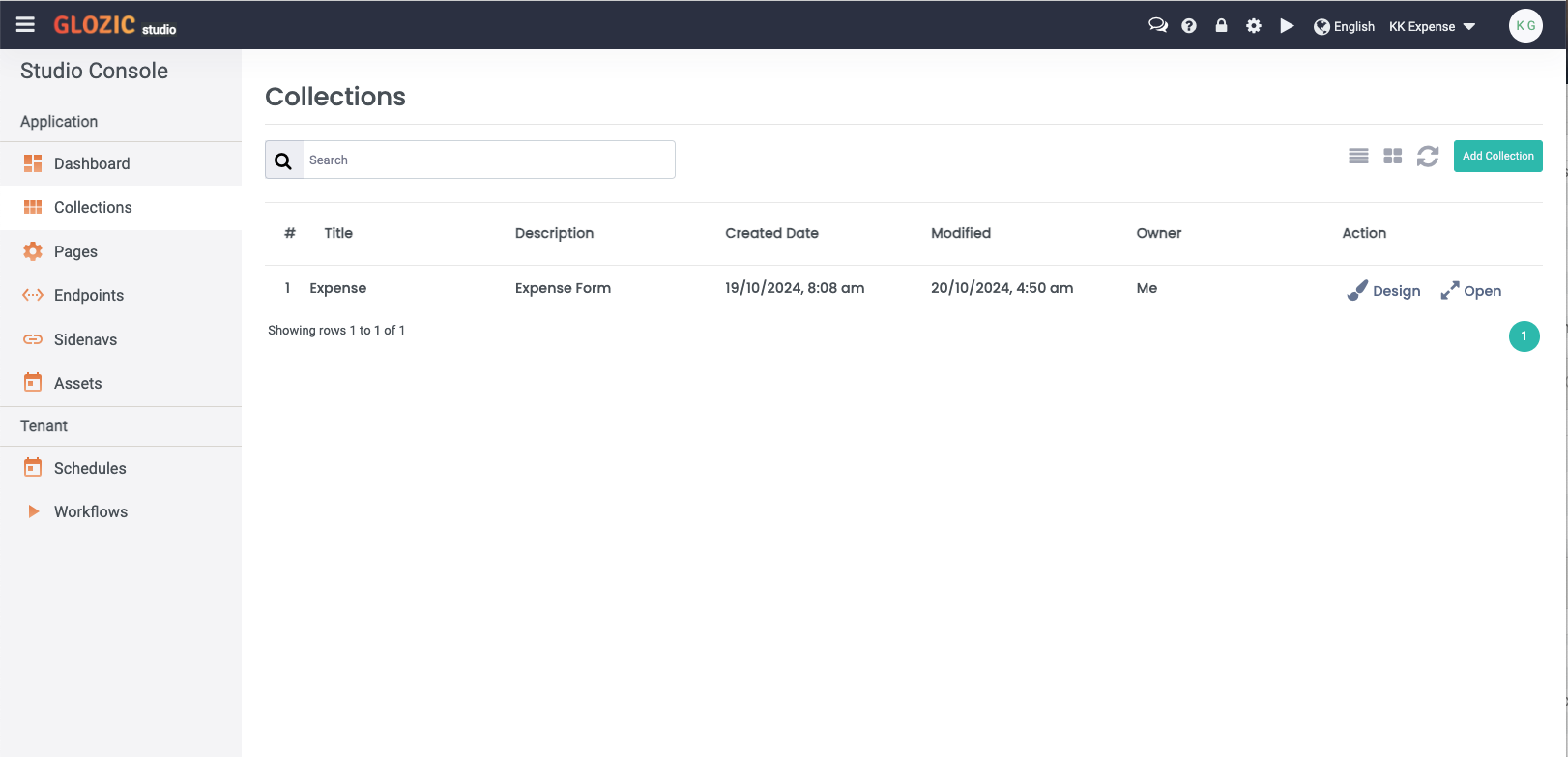
Click the Open from the Action column of the Expense from the Collections list to examine the newly created Expense collection. You should be presented with something similar to the below screen capture:
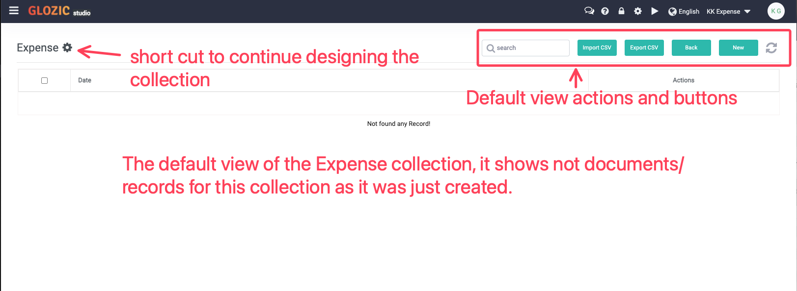
Click the New button from the top-right buttons set of the view to try create and save a new Expense document. Once submitted/saved, a new Expense document will be added to the view as shown below
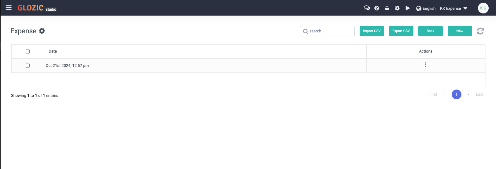
Proceed to the next section of tutorial on Creating and customizing Collection Views
Customize the Default View
Click the "Cog" icon to continue designing the Expense collection
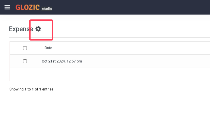
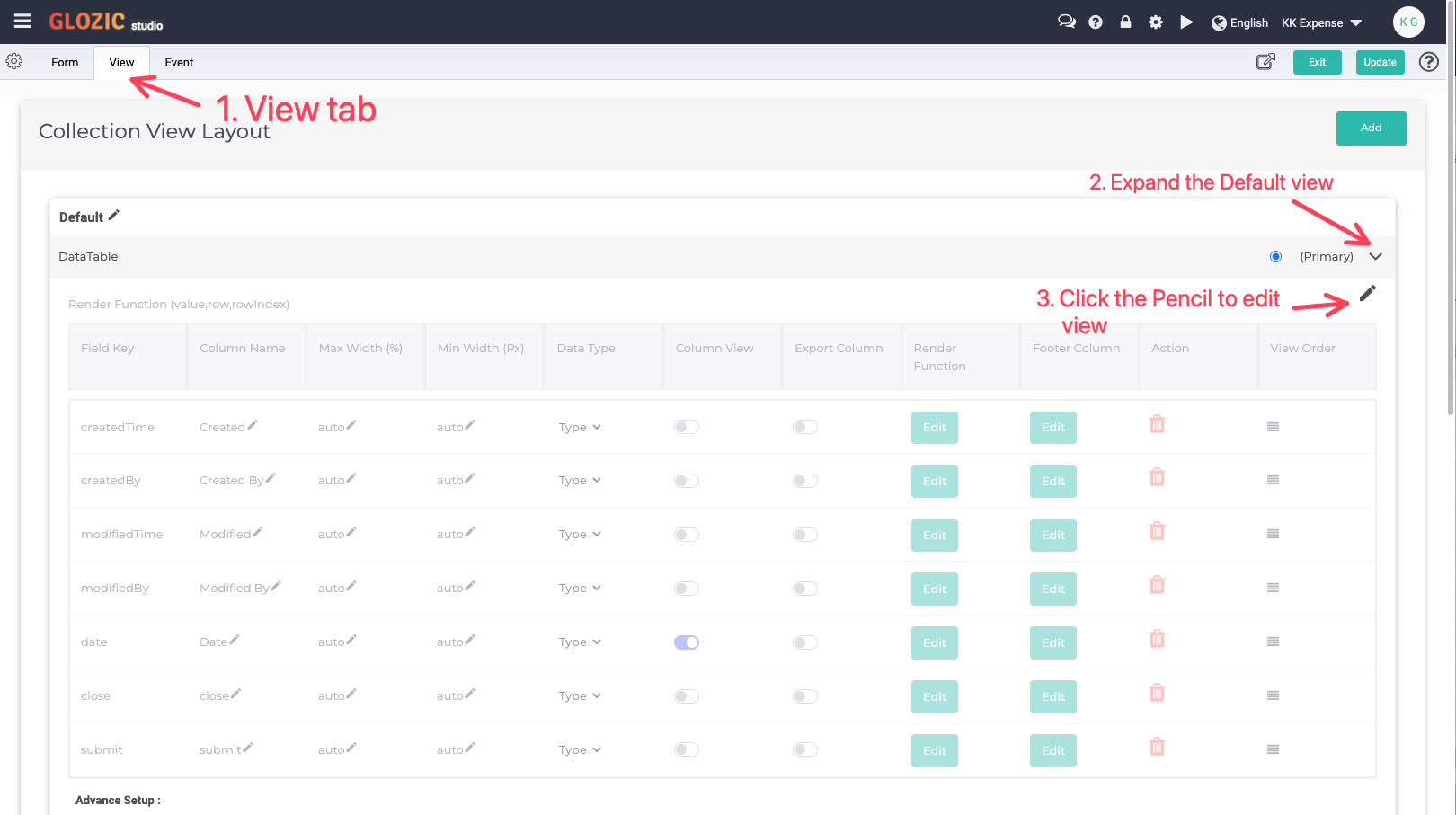
Follow the sequence highlighted in the below screen capture to edit the Default view.
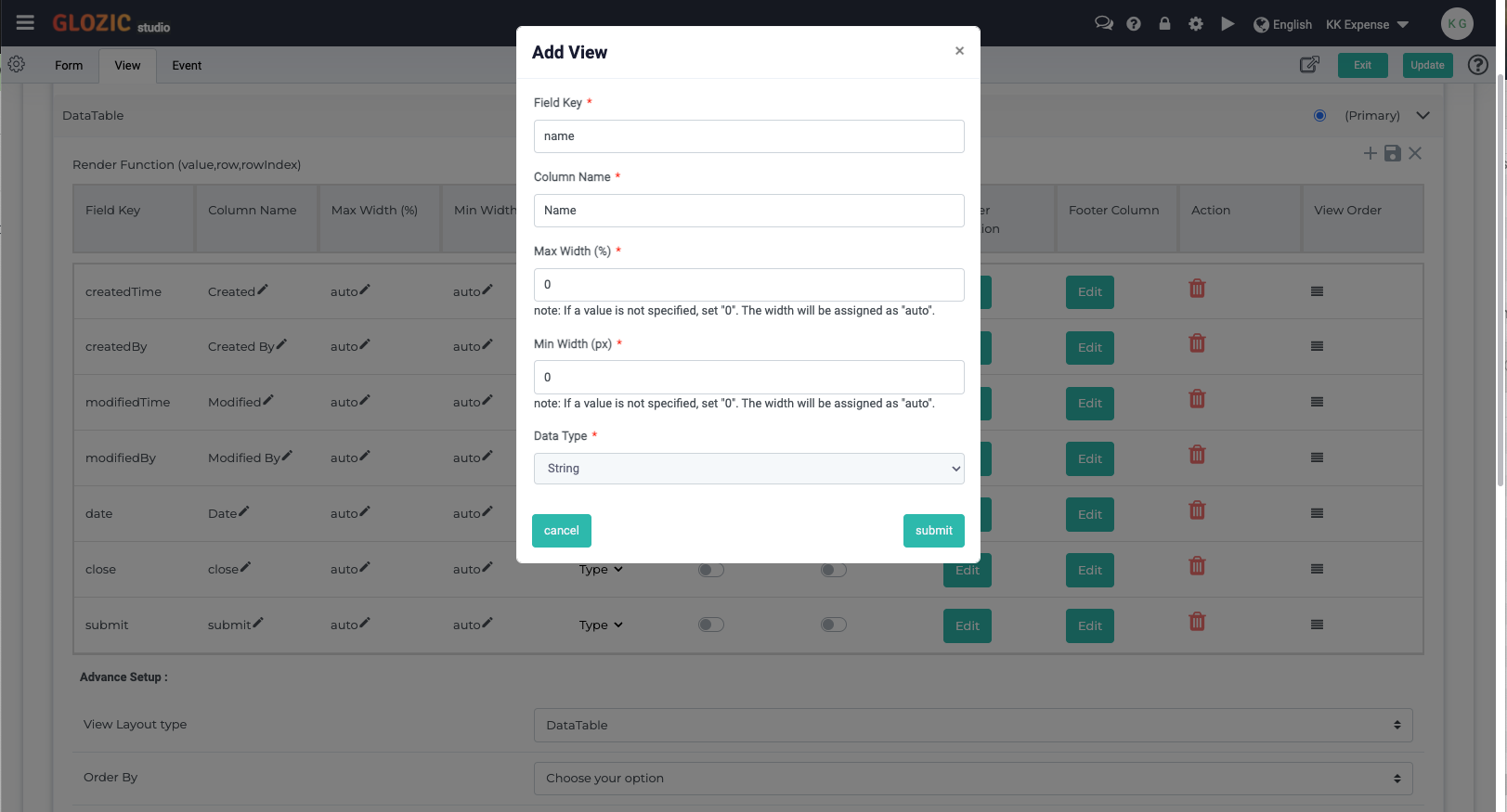
Switch on the Column View radio button of name field, if the name field is not listed in the fields list, you may click the "+" sign on the top-right to add it manually, fill in the required values as shown in the below screen capture to add the name field.
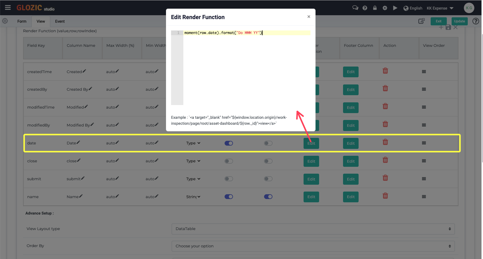
Click the Edit button of the Render Function for the date field, paste the following function to format the date column moment(row.date).format("Do MMM YY"), take note that we may use Moment date library for Date formatting and manupulation.
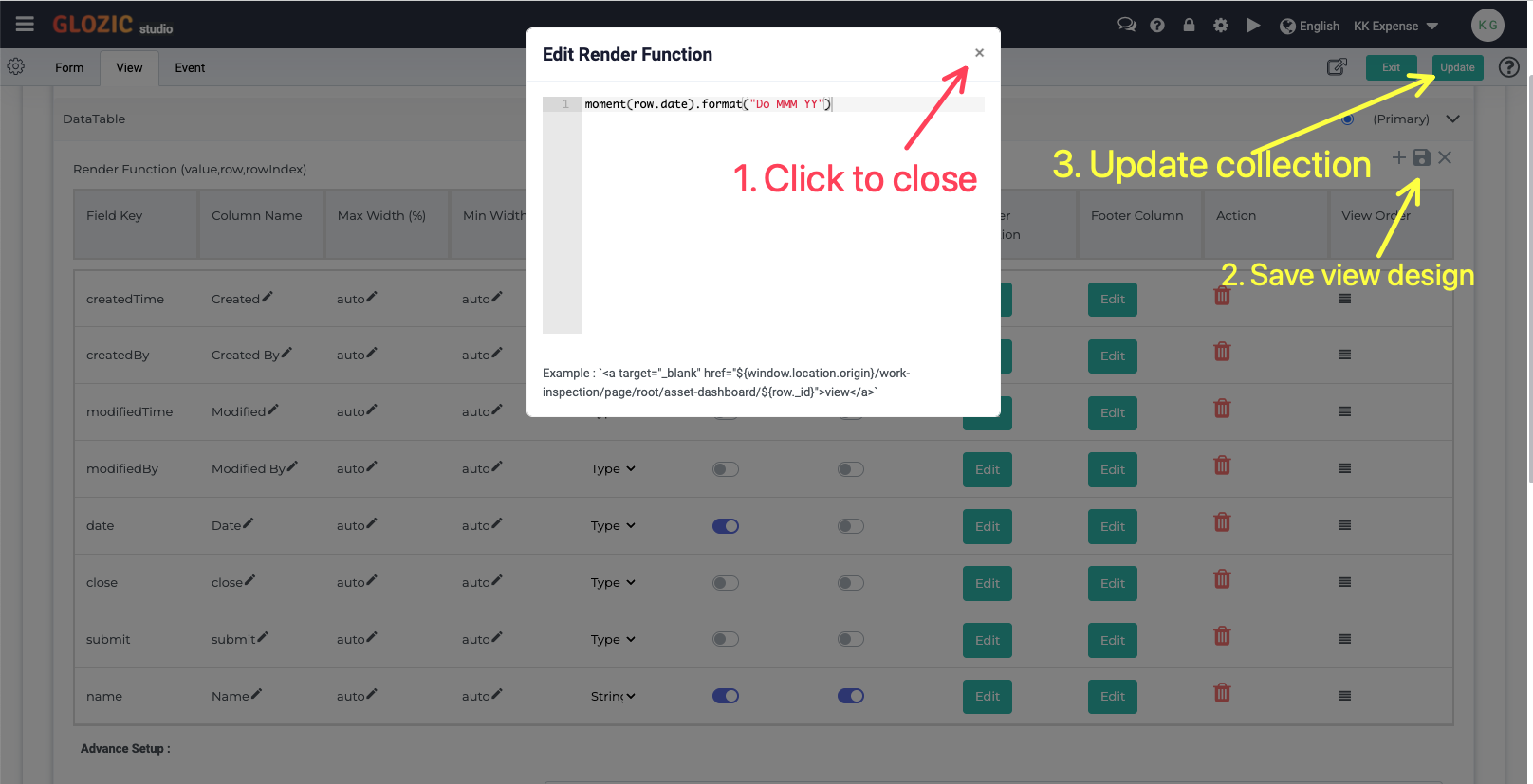
Follow the steps highlighted in the below screen capture to close the "Render Function" edit box, save the view design, and update the Collection design.
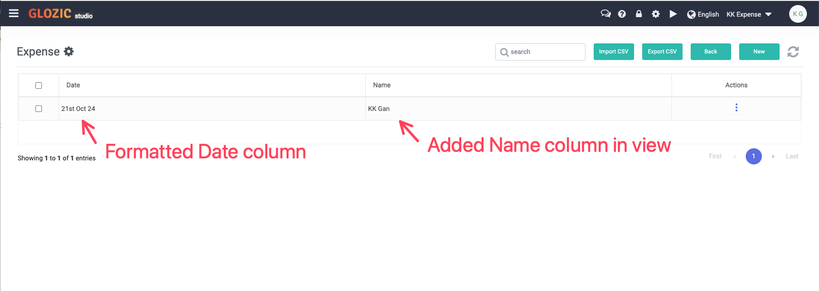
Open the Expense collection again to examine the changes we have done to the Default View. You should be seeing the Default View of the Expense collection is now updated similar to the below screen capture.
Add a JSON List View
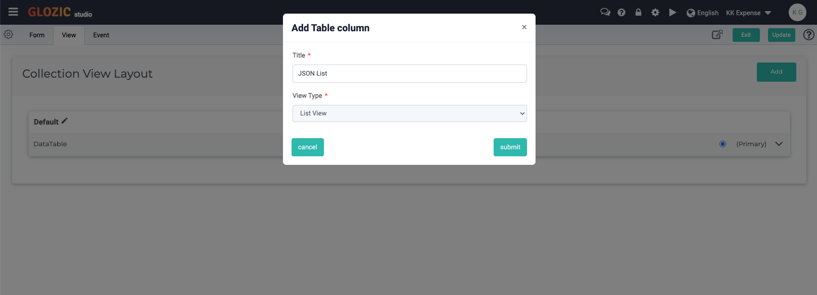
Back to the Collection Designer, go to View tab, click Add button to add a new View for the Expense collection. Give the new view a name e.g. JSON List, select List View as the View Type to add. See below screen capture for example
Click Submit button to submit the new view, a new view should be added similar to the below screen capture.
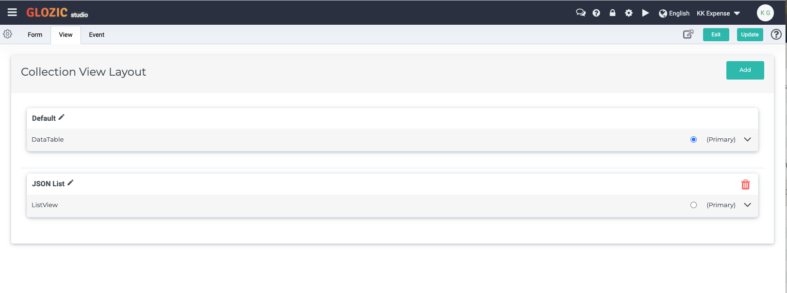
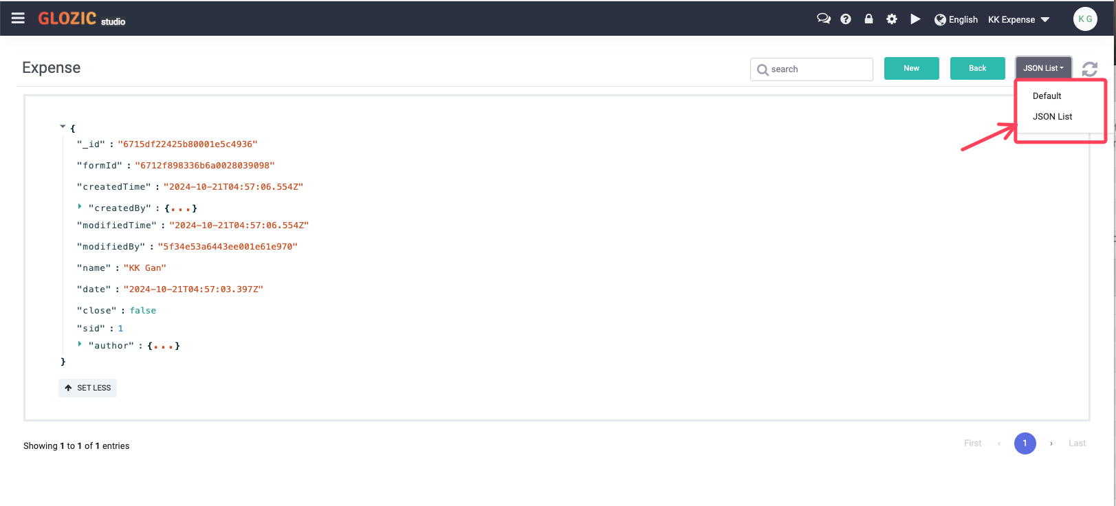
Update the collection design, and click Exit to exit from the collection design. Open the collection again to examine the updated Expense collection. Notice from the View Selection dropdown with the JSON List view added, select the JSON List from the View Selection to examine the content of the document/record of the view. This is shown in the below screen capture example.
Collection Events
Collection Events fires the events when
- Document being created
- Document being modified
To trigger actions such as sending email, calling a web service, start a workflow, etc.
Open the Collection Designer for Expense collection again, click the "Event" tab to design collection events. Drag-and-drop a "Send Email" action onto the flow designer placeholder, configure the Send Email action with the example in the below screen capture
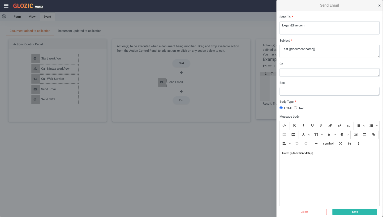
You may use lodash templating language to get value from the document, e.g. {{document.name}}, {{document.date}} which stands for the properties' value of the document being processed.
Update the collection design, try it out by adding a new Expense document to the collection. Expect receiving an email sent when a document is being created in the collection.